You are using an out of date browser. It may not display this or other websites correctly.
You should upgrade or use an alternative browser.
You should upgrade or use an alternative browser.
Branding logo
Started by thefootfixer

PuffyShirt
Full Member
There are graphic designers on etsy that you can work with, just look up logos for businesses
LMAO you got me LOL'ing. Please don't get banned like Cutwithfury did 😢Would you like a high resolution image of my avatar to help you?
😢
Fiverr is cheap
Use the map of your state, county or city and stick a foot in it. There you have it. You have a logo.
Go to fiverr and find someone with good reviews and pay $20 with tips and you got yourself a professional logo.
Go to fiverr and find someone with good reviews and pay $20 with tips and you got yourself a professional logo.
It's not that serious. You can always change a logo. Not a big deal. Anybody ever lost patient because you changed your logo? We are not fashion designers lolMy advice: hire a pro. It's your brand and it's going to represent you for years, if not your entire career.
If Nike or Adidas change their logo then they are in trouble but not a podiatrist.
YOU the doctor are the brand from the begining and entire career. Best for OP to focus on being the best doctor that will represent him/her their entire career.
Fine, don't take my advice.It's not that serious. You can always change a logo. Not a big deal. Anybody ever lost patient because you changed your logo? We are not fashion designers lol
If Nike or Adidas change their logo then they are in trouble but not a podiatrist.
YOU the doctor are the brand from the begining and entire career. Best for OP to focus on being the best doctor that will represent him/her their entire career.
I don’t even remember the names of doctor and podiatry practices, let alone their logo, I only care about the doctor’s work and hence their name
Advertisement - Members don't see this ad
Logo design contests are also a cheaper alternative that will give you lots of options. Lots of websites available. I think I did mine through 99designs
Basically you give info on what you are looking for (I specifically told them not to put a foot in the logo like every other podiatry clinic I’ve ever seen). You then pick a prize amount (I think I did around $300-400, the less you offer the fewer entries you get) and freelance designers come up with designs and submit them. After a week (or however long you keep them open), you pick some favorites and give those people feedback. They modify for you, change color pallets, tweak aspects of the logo, or come up with something totally different and you select your favorites again. Just like a tournament. Winner ends up giving you all the original files, font selections, primary and alternate color schemes, etc.
I liked my logo…even if it only got used for 9 months or so lol
What a great idea! I can't recall what we paid for our graphic designer's work. I think it was around $1000? You're right about the cliche'd foot image. It's hard to get away from it with a podiatry practice and I've seen some really bad ones. Super low-rent like they had their kids draw it.Logo design contests are also a cheaper alternative that will give you lots of options.
Basically you give info on what you are looking for (I specifically told them not to put a foot in the logo like every other podiatry clinic I’ve ever seen). You then pick a prize amount (I think I did around $300-400) and freelance designers come up with designs and submit them. After a week (or however long you keep them open), you pick some favorites and give those people feedback. They modify for you, change color pallets, tweak aspects of the logo, or come up with something totally different and you select your favorites. Winner ends up giving you all the original files, font selections, primary and alternate color schemes, etc.
I liked my logo…even if it only got used for 9 months or so lol
I don't understand the logic of being a podiatrist and you don't want a foot/ankle image in your logo. What are you running away from?
I guess it's the same logic like fellowship trained foot and ankle lower extremity orthoplastic nerve grafting limb lengthening surgeon who will do everything to avoid being called the P word. As the end of the day a P is still a P. We are all Ps
I guess it's the same logic like fellowship trained foot and ankle lower extremity orthoplastic nerve grafting limb lengthening surgeon who will do everything to avoid being called the P word. As the end of the day a P is still a P. We are all Ps
I don't understand the logic of being a podiatrist and you don't want a foot/ankle image in your logo. What are you running away from?
I guess it's the same logic like fellowship trained foot and ankle lower extremity orthoplastic nerve grafting limb lengthening surgeon who will do everything to avoid being called the P word. As the end of the day a P is still a P. We are all P
Running away from that P saturation.
Sometimes when it rains I turn into a Wet Azz P.
Well, I just checked my website and it does have someone running and some feet on it. Was going to say I'd kill myself if I saw one more photo of feet in the sand or adult/children feet sticking out of a bed together.
Just please no picture of feet with wings on it.... Nothing is more lame than that
Having a foot on your logo does get the point across (in hammerlike fashion) but from an artistic standpoint it's cliche and unimaginative. Don't any of you guys go changing your logo on my account though, lol.I don't understand the logic of being a podiatrist and you don't want a foot/ankle image in your logo. What are you running away from?
It's like getting the same tattoo as everyone else. Celtic armband, dolphin, sea turtle, Chinese letters, "Live, Laugh, Love"...
Last edited:
Oh no!Just please no picture of feet with wings on it.... Nothing is more lame than that
Advertisement - Members don't see this ad
Live, Laugh, Love a P. That should be the new ABPM/ACFAS/APMA/ABFAS/AAFOAN/APPP etc slogan
Classic.
Novels, Songs written about it.
They said your day was determined by which side you first saw in the morning.
The Happy Foot/Sad Foot Sign in Los Angeles
A cult following celebrates the legend that belies this curious podiatrists' office sign which has worked its way into song, literature, animation, and the visual arts.
nice sulcus
5th toe is barely attachednice sulcus
Running away from that P saturation.
Sometimes when it rains I turn into a Wet Azz P.

I don't understand the logic of being a podiatrist and you don't want a foot/ankle image in your logo. What are you running away from?
I guess it's the same logic like fellowship trained foot and ankle lower extremity orthoplastic nerve grafting limb lengthening surgeon who will do everything to avoid being called the P word. As the end of the day a P is still a P. We are all Ps
I don’t think they are running away from anything. As Natch alluded to, an actual logo is usually creative or artistic imagery that conveys some sort of message and establishes your brand. Nothing wrong with taking the literal approach and putting a foot on the logo like every other podiatry clinic. But how many companies elsewhere do that? Nike didn’t choose a shoe as their logo. Nor did apple or Microsoft make computer logos. Which major automotive manufacturer has a car as their logo? Orthopedic clinics generally don’t have a bone or skeleton as their logo.
If you want to do some marketing by sponsoring people at local races or fun runs, or have any sort of branded apparel that you give to staff or patients, I promise you that nobody is wearing the foot logo shirt or hat around town casually. Having a non foot logo has nothing to do with avoiding being a podiatrist, I’m sure “foot” is already in the practice name and plastered all over the website. Maybe you just want to stand out from the competition (who will all have foot logos) with something that is pleasing to the eye, or something that represents their community/region/geography, or something that gets people asking questions when they see it in public, or something that invokes a certain thought or emotion. I know that sounds crazy to a lot of private practice podiatrists…
And BBQ restaurants with cartoon pigs in their logo.Having a foot on your logo does get the point across (in hammerlike fashion) but from an artistic standpoint it's cliche and unimaginative. Don't any of you guys go changing your logo on my account though, lol.
It's like getting the same tattoo as everyone else. Celtic armband, dolphin, sea turtle, Chinese letters, "Live, Laugh, Love"...
I literally never want to see a cartoon version of the animal I’m about to eat when I go to a restaurant.
And BBQ restaurants with cartoon pigs in their logo.
But you know who doesn’t do this? The best BBQ joints in TX don’t. Goldee’s, Leroy and Lewis, Panther City, Interstellar, Franklin, Burnt Bean Co, Heim BBQ, Derek Allan’s, etc. None of them use a pig or cow logos.
But it kinda makes you wonder why they are running away from meat? Ya know?
I can confirm that Goldee’s (at least last year) did have a cow on their sign. I wasn’t super impressed with it. I still prefer Pecan Lodge in DFW, though still haven’t tried Terry Black’s.But you know who doesn’t do this? The best BBQ joints in TX don’t. Goldee’s, Leroy and Lewis, Panther City, Interstellar, Franklin, Burnt Bean Co, Heim BBQ, Derek Allan’s, etc. None of them use a pig or cow logos.
But it kinda makes you wonder why they are running away from meat? Ya know?
The psychedelic cow is even larger on the side of the building, but it still isn’t their “logo.” Panther City and Derek Allan’s are both better than Pecan Lodge, but I’m biased since I remember when the Panther City guys were working out of essentially a trailer near the hospital and I off chance befriended Derek Allan after residency. Derek Allan’s brisket breakfast sandwich is killer. I guess the nostalgia and relationships make the food taste better.
Advertisement - Members don't see this ad
I don’t think they are running away from anything. As Natch alluded to, an actual logo is usually creative or artistic imagery that conveys some sort of message and establishes your brand. Nothing wrong with taking the literal approach and putting a foot on the logo like every other podiatry clinic. But how many companies elsewhere do that? Nike didn’t choose a shoe as their logo. Nor did apple or Microsoft make computer logos. Which major automotive manufacturer has a car as their logo? Orthopedic clinics generally don’t have a bone or skeleton as their log
If you want to do some marketing by sponsoring people at local races or fun runs, or have any sort of branded apparel that you give to staff or patients, I promise you that nobody is wearing the foot logo shirt or hat around town casually. Having a non foot logo has nothing to do with avoiding being a podiatrist, I’m sure “foot” is already in the practice name and plastered all over the website. Maybe you just want to stand out from the competition (who will all have foot logos) with something that is pleasing to the eye, or something that represents their community/region/geography, or something that gets people asking questions when they see it in public, or something that invokes a certain thought or emotion. I know that sounds crazy to a lot of private practice podiatrists…
Agree with most that you said except a few below
Apple literally use a freaking apple as their logo lol. It will be hilarious if they ran away from using an apple and used a banana instead.Nor did apple or Microsoft make computer logos
I disagree with this statement. Most orthopedic (obviously not all), like podiatry, use their specialty in their logo. The ortho spine will use a spine in their logo, same as ortho hand etc.Orthopedic clinics generally don’t have a bone or skeleton as their logo.
Apple literally use a freaking apple as their logo lol. It will be hilarious if they ran away from using an apple and used a banana instead.
Their company name is “Apple”. It would be like a podiatry office called “Bigfoot podiatry clinic” having a Sasquatch as a logo. Or “barking dogs foot and ankle” having a bulldog logo.
That’s the Goodyear tire logo that podiatry practices like to use
Last edited:
Replace the lettering with "Foot" and "Gear"That’s the Goodyear tire logo that podiatry practices like the use
Prefer Continental DWS O6+, Michelin PS4S for all seasons.
While driving around town this morning I was thinking about business logos some more, and I thought about dentists. When I got home and did a Google search of the local dentists, six of the first ten practices that came up have mountains in their logo. I guess that makes sense since we live at the foot of the Cascades, but if "everyone" is doing it, is it unique? Three of the practices have an abstract design, like stripes, dots, or curvy lines. Not sure they signify anything but they look stylish. Only one practice though, that of a periodontist, has a tooth in their logo.
A logo is a tool used by companies, a brand is the feeling customers get, and it’s what customers say about the company. Logo is not a brand. Look up the work and books by Marty Neumeier and TheFutur for more on this stuff
Most small podiatry offices aren’t in the business of developing a “brand” as a company. The “brand” is what patients feel about YOU as a doctor or surgeon. Your logo as a tool is best served to be a clear tool to help new potential patients recognize immediately what your company offers, which are podiatry services.
Most small podiatry offices aren’t in the business of developing a “brand” as a company. The “brand” is what patients feel about YOU as a doctor or surgeon. Your logo as a tool is best served to be a clear tool to help new potential patients recognize immediately what your company offers, which are podiatry services.
Well, you're not wrong there. Most small podiatry offices do insist on putting a foot or feet on their logo. It bluntly gets the point across.Most small podiatry offices aren’t in the business of developing a “brand” as a company. The “brand” is what patients feel about YOU as a doctor or surgeon. Your logo as a tool is best served to be a clear tool to help new potential patients recognize immediately what your company offers, which are podiatry services.
If that were the case then I'm sure some patients would imagine our brand as a foot getting shoved up an a** lolThe “brand” is what patients feel about YOU as a doctor or surgeon.
Advertisement - Members don't see this ad
Most small podiatry offices aren’t in the business of developing a “brand” as a company. The “brand” is what patients feel about YOU as a doctor or surgeon. Your logo as a tool is best served to be a clear tool to help new potential patients recognize immediately what your company offers, which are podiatry services.
I would argue that the first sentence in the above quote is a problem. Obviously you aren’t developing a “brand” in the same sense as Apple, who is offering multiple product lines across multiple market segments. But they should still strive to create a logo that develops their “brand” and describes more than just “feet.” You have to set yourself apart from your competition. Maybe your practice wants to focus on sports medicine, maybe your office is modern, clean, technologically savvy. Why shouldn’t your logo attempt to convey that? A foot logo certainly does not.
What if I don’t want patient to immediately think “podiatrist” when they see a logo? It’s been pretty well documented here that “podiatrist” evokes a lot of, “that young man or woman can cut my toenails because I can’t reach them” mentalities. If a non foot logo reduces some of that, and instead attracts a younger, more active patient population, is that a bad thing?
Everyone is free to take a very simplistic approach to their logo. Make it a foot. I don’t care. I wouldn’t do it. I didn’t do it. Especially in the community I opened up shop in, where podiatry was historically a toenail clipper. That’s what a foot logo meant to people. I didn’t want to evoke that kind of thought or emotion from people because I knew those people would find me regardless, and anything I could do that didn’t scream, “I’ll bust those crumblies for you,” was for my benefit.
You’re right, a logo can help reinforce the feelings a customer might have about you as a provider or group. Logo designs can get very expensive the better you want the designer to be able to hone down your design goals and what you want your customers to think and feel when they see your logo. Usually for a new pod office who can’t afford nor do they need high level designers, you might be disappointed if you expect an amazing logo. I think something that looks professional, shows what you do, is good enough. You can always rebrand with a new logo and office feel if you want to come across as special or different from other doctors. But for a startup funds are probably better allocated for good staff that represents you well, because like it or not your staff is part of your brand. And secondly a good website service that helps elicit good google reviews and filters out the bad ones. I use patientpop, they’re really good at making sure bad reviews are sent to us in private and good reviews are encouraged to post publicly, helping me build my brand better than a logo would
Edit: to clarify, I think the price around ~500 (such as in 99designs) is good enough for most groups that want a nice logo. For a $20 logo like from Fiverr you might get lucky with a good one but it’s a gamble, you get what you pay for usually. Just make sure your designer isn’t using stock images to compile a logo that you don’t have legal rights to using
Last edited:
Mostly I’d want a design that I’m happy looking at a lot. It’ll be on your door, letterhead, website, company clothing, business cards, etc. You could always redo it later but then you’ll have to redo it everywhere all at the same time so I’d rather just spend a little extra and have something nice right off the bat. Buy once/cry once.

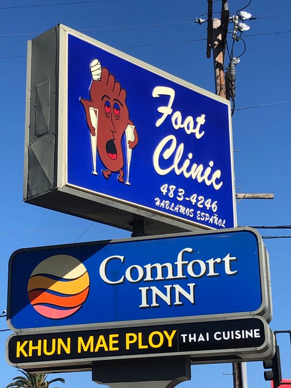
Here you go, free of charge.
Gold. Pure gold.
D
deleted285117
Here you go, free of charge.
Attachments

Solid first post.Here you go, free of charge.