
You are using an out of date browser. It may not display this or other websites correctly.
You should upgrade or use an alternative browser.
You should upgrade or use an alternative browser.
This new forum looks awful
Started by mentos

Get help with your application
Use all the free resources available to you from SDN: articles, guides, expert advising, forums discussions, and school research.

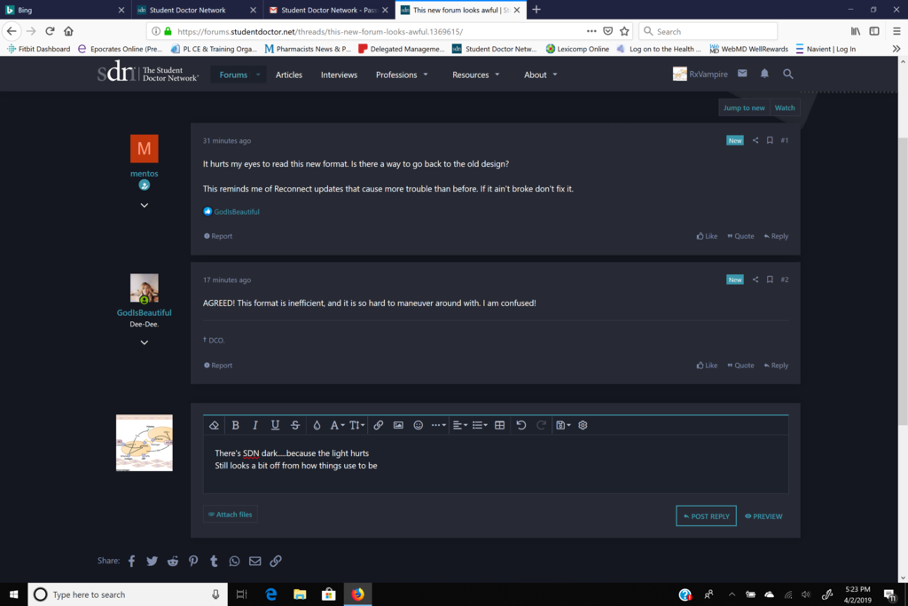
AGREED! This format is inefficient, and it is so hard to maneuver around with. I am confused!

There's SDN dark.....because the light hurts
Still looks a bit off from how things use to be...mainly too colorful & now with emoji responses? Angry, sad, wow, haha, love....><
Still looks a bit off from how things use to be...mainly too colorful & now with emoji responses? Angry, sad, wow, haha, love....><
Last edited:
Advertisement - Members don't see this ad
Yep, terrible update. I can’t even tell which threads are new anymore. Just looking at timestamps...

Change is hard.
Give it a chance.
Right you are! But change also comes with warnings; it is common courtesy. 🙁
But I guess SDN is trying to modernize, just like other social media platforms! Hopefully we grow to like it.

This April Fool's joke is always a surefire dumb people detector

To be fair, update warning was posted yesterday 4/1/19 for 4/2/19 7am system maintenance. A lazy April fool's jokeThis April Fool's joke is always a surefire dumb people detector
Its April 2nd though.... This would be like going trick or treating the day after Halloween.This April Fool's joke is always a surefire dumb people detector

This April Fool's joke is always a surefire dumb people detector
Who does April fool's on the 2nd?

Come and commiserate with us: https://forums.studentdoctor.net/threads/upgrade-feedback-and-bug-log.1369606/

It’s not a joke. I also hate change but eventually you will get used to it and then you can complain about the next update. You have some template options to choose from as well.
Personally I miss the dark blue lite blue scheme from when I joined. 🙁
Personally I miss the dark blue lite blue scheme from when I joined. 🙁

This is a bit too Microsoft Metro for my taste. Unfortunately, I see this Swedish spare design everywhere from Arlanda to Seattle. I'm used to this, but I wish we went with a less polished aesthetic to a more cozy one.
Advertisement - Members don't see this ad
So basically nobody likes this, why did they do it?
Probably for back end and security issues. Forum software does version, you know.
So basically nobody likes this, why did they do it?
Our real mistake was not posting a pole with a do nothing option. I see that now.

This April Fool's joke is always a surefire dumb people detector
Yea.... I remember this happening before.. but it’s one day late...

I hate change. Where are my teeth? Speak into my good ear.

Wth … with this new update I couldn't login through chrome. I had to use internet explorer.
Wth … with this new update I couldn't login through chrome. I had to use internet explorer.
You're welcome.
Basic style preference now available....anyone else want a Basic-Dark/night setting?


Our real mistake was not posting a pole with a do nothing option. I see that now.
Truth. New layout sucks.
You have to clear your cookies. A lot of people have been experiencing this.Wth … with this new update I couldn't login through chrome. I had to use internet explorer.
Loving the new look, keep up the good work sent!

This is clunky and ****ty.
The maudes need to stop breaking this forum.
The maudes need to stop breaking this forum.
This is clunky and ****ty.
The maudes need to stop breaking this forum.

I am glad you all posted this thread. I did not know where else to go for info. I think the basic is best at this point. Fontwise it is good and not confusing. Usually, websites let you know WAAAAY in advance before updating. Not 1-2 days.
Advertisement - Members don't see this ad
Whoever thought this change was a good idea needs to be fired/lose mod privileges.
Click the three lines at the top left cornerI can't find the search function, did they get rid of it? Using mobile site.
Yep, terrible update. I can’t even tell which threads are new anymore. Just looking at timestamps...
Okay after about a week I finally realized that they alternate dark and light colors for each thread regardless of timestamp. The old forum was much easier to see which threads were unread, not you can't tell
Okay after about a week I finally realized that they alternate dark and light colors for each thread regardless of timestamp. The old forum was much easier to see which threads were unread, not you can't tell
Unread thread titles are bold, read titles are not. I also dislike the new system. We will see if our voices are heard. 😉
Also if you use the app nothing has changed as far as I can tell. I always preferred the app experience anyway.
Terrible... Who thought of that?
Must have been the super mods.

What style are you guys using? Have you tried Basic? Any issues?
Basic is working well for me. There is a reddit thread about the updates on SDN.
Basic... They should also let people use the previous ones. I liked the light blue they had before.What style are you guys using? Have you tried Basic? Any issues?
Basic... They should also let people use the previous ones. I liked the light blue they had before.
Any issues? Apparently, the previous styles aren't compatible with the current update 🙁


I agree with people saying the Basic works the best, it's much less distracting.
I agree with people saying the Basic works the best, it's much less distracting.
Just changed to Basic. A little less annoying than the gouge my eyes out "new" format.
Why can't we have the old way back, though?
Advertisement - Members don't see this ad
Just changed to Basic. A little less annoying than the gouge my eyes out "new" format.
Why can't we have the old way back, though?
It could be that the old style is no longer supported with the latest version of the forum software. I feel sympathy toward the admins because I face the same complaints when Epic decommissions someone's favorite background or moves a button to a different spot.


