- Joined
- Apr 6, 2014
- Messages
- 14,146
- Reaction score
- 22,787
I've talked about this theory in some threads but finally plotted it out of curiosity and thought I'd share the visual.
Back when the AAMC tables updated with data for the new MCAT (MCAT2015), there was something very odd:
The admit rate for people with the MCAT2015 was only 32.0%, while the overall admit rate for the cycle had been 41.5%.
Crazy, right? What was going on, were adcoms subconsciously biased against the unfamiliar new exam?
Well, it doesn't look like that is true, because in comparable stats bins the admit rates stayed the same - for example on the new grid, 3.9/518+ has an 87.5% admit rate, while on the old grid the same percentile group (3.9/36+) had an 87.9% admit rate. Similarly, all GPAs with 518+ had a 79.2% admit rate, while all GPAs with 36+ had a 79.5% admit rate. This kind of similarity got a little rougher in other bins, since the percentiles on MCAT types were not exactly equivalent, but overall the pattern held up with very similar success rates for similar scores.
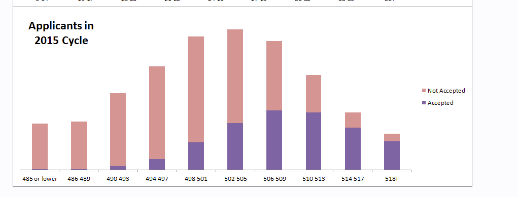
So why the drastically lower admit rate with the new MCAT? It looks like it was because people on the lower end of the curve were much more likely to apply now than they used to be under the old exam.
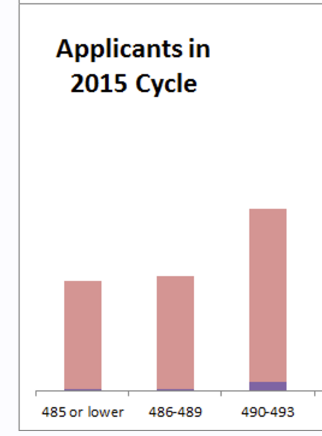
Here are the applicant distributions for the most recent cycle and the composite of the three prior cycles, with proportion admitted also shown:
Edit: Note that the far right are equivalent percentile (36+ = 518+) and the far left are approx. equivalent (486 = 17). See this conversion table. So for both graphics you are looking at the same percentile ranges across the same sized axis, the bins are just different.
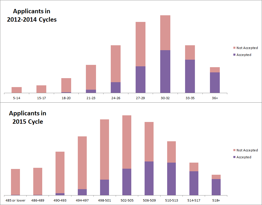
So there you have it - you got a whole lot more pink going on for the bottom distribution's middle and left sections. Mystery solved, in my opinion - either because people didn't understand how their scores compared to MSAR ranges, or because they expected schools to change their behavior with the new exam, many more people with average and below average numbers went ahead and applied than we saw historically.
Also: Important to note GPA distributions did not change much despite the overall left shift in the applicant score distribution. For example among all applicants with a 3.00+ GPA, each bin of 0.2 contained the following percentages:
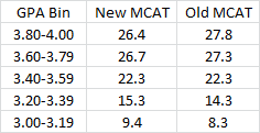
Very similar.
Back when the AAMC tables updated with data for the new MCAT (MCAT2015), there was something very odd:
The admit rate for people with the MCAT2015 was only 32.0%, while the overall admit rate for the cycle had been 41.5%.
Crazy, right? What was going on, were adcoms subconsciously biased against the unfamiliar new exam?
Well, it doesn't look like that is true, because in comparable stats bins the admit rates stayed the same - for example on the new grid, 3.9/518+ has an 87.5% admit rate, while on the old grid the same percentile group (3.9/36+) had an 87.9% admit rate. Similarly, all GPAs with 518+ had a 79.2% admit rate, while all GPAs with 36+ had a 79.5% admit rate. This kind of similarity got a little rougher in other bins, since the percentiles on MCAT types were not exactly equivalent, but overall the pattern held up with very similar success rates for similar scores.
So why the drastically lower admit rate with the new MCAT? It looks like it was because people on the lower end of the curve were much more likely to apply now than they used to be under the old exam.
Here are the applicant distributions for the most recent cycle and the composite of the three prior cycles, with proportion admitted also shown:
Edit: Note that the far right are equivalent percentile (36+ = 518+) and the far left are approx. equivalent (486 = 17). See this conversion table. So for both graphics you are looking at the same percentile ranges across the same sized axis, the bins are just different.

So there you have it - you got a whole lot more pink going on for the bottom distribution's middle and left sections. Mystery solved, in my opinion - either because people didn't understand how their scores compared to MSAR ranges, or because they expected schools to change their behavior with the new exam, many more people with average and below average numbers went ahead and applied than we saw historically.
Also: Important to note GPA distributions did not change much despite the overall left shift in the applicant score distribution. For example among all applicants with a 3.00+ GPA, each bin of 0.2 contained the following percentages:

Very similar.
Last edited:

