

Advertisement - Members don't see this ad
OK before we dissect ads 3-5 I am going to post two of my previous yellow pages ads. One is an ad that I designed and the other is one that my ex-partner designed with some help from the yellow page sales person. I am also going to do something that is absolutely essential in your professional growth. I am going to critique myself and have you guys critique me as well. We will go over what works in these ads and what doesn't work. And please be honest, I appreciate constructive criticism. Hopefully by pointing out things that you don't think work it will get me to think in another direction and reveal to me things that I may have over looked. So here they are:
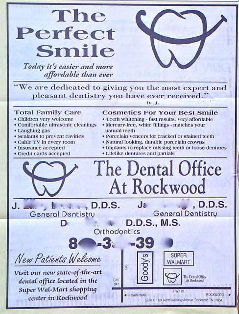
Hammer AD 1
Hammer AD 2
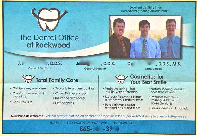
I much prefer the second add to the first, but it's still not perfect.
#2:
-I like the background design- and while it does not directly contribute to patient information, it is professional, catchy and likely to get someone's attention- at least when compared to the first.
- Personally, I would like the see the person who is treating me in the ad, not generic patients with big smiles. I like the picture, I like the color in the ad, and I like the proportions much better than the first. "The perfect smile" is too big in the first one IMO.
-I would have made the phone number bigger at the bottom and eliminated some of the wordiness under "total family care" and "cosmetics for your best smile". Instead of saying, "teeth whitening, fast results, very affordable" I would have limited myself to more of a bullet style word lists:
e.g.:
- Affordable whitening
- tooth colored fillings
- sealants
- natural looking veneers/crowns
- dentures, partials
- Laughing gas
Then, I would have taken the map from the first ad and placed it where cosmetics for your best smile is in the second.
I think the mission statements in both are a little long and wordy. You said yourself, shorter is better. "we are dedicated to giving you the...received" is too long, not very catchy. "Excellent dentistry in...environment" is better, but I still think it's too long.
I would go with something like, "Exceptional quality, exceptional care" or perhaps "Dedicated to the patients we serve"
Now, the only question left is, which one are you in the picture? The one on the left? or the one in the middle? My guess is the one on the left, since that name is first, and since you were the owner and your partner you said was an old high school classmate younger than you.


