Physician Compensation Annual Change 2010-2016 By Specialty (Medscape Compilation)

This forum made possible through the generous support of SDN members, donors, and sponsors. Thank you.

ShenandoahDoc

Full Member
7+ Year Member
Joined
Jul 9, 2015
Messages
65
Reaction score
67
While looking at physician salary there have been large changes year-to-year; and I wanted to get a more normative picture of how compensation has changed which might explain/predict trends. Below are the charts showing the change in salary in percentage and total amount from year-to-year for 2010-2016; color coded to show good and bad years. My numbers are from the Medscape Physician Compensation Report.

Below is the graph of the annual change. Of note is that all three Primary Care Specialties (Family, IM, Peds), are in the top 10; signaling that primary care has experienced a significant increase in compensation since 2010. (OBGYN if included in primary care is on the low end).

upload_2018-1-11_11-46-16.png


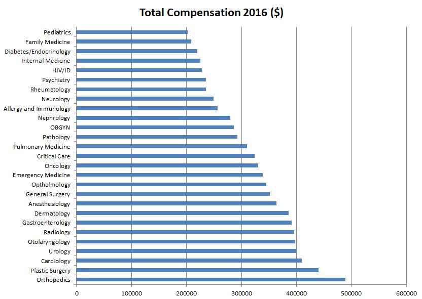
Now compare this graph with the total compensation.
upload_2018-1-11_11-46-26.png


Again the most striking change I noted was that Primary care, while making up 3 of the 4 lowest paid specialties, has made huge gains in compensation since 2010. Meanwhile some specialties (anesthesiology, Radiology, Oncology, Gen Surg) have been nearly stagnant, all below the consumer price index change which can be interpreted as having a decline in pay. (Of course they still had very large absolute increases so they're hardly in poverty).

Below is the year-to-year data. Color coding is based on the Consumer Price Index (which measures the purchasing power of your salary and averages around 3% increase per year) and coded as follows;
Salary change:
<3% : Red
3-6% : Blue
6-12% : Green
>12% : Gold

upload_2018-1-11_11-47-1.png


Most specialties had at least 1 very good year, usually followed by a normalizing the following year; for this reason Plastic Surgery's massive increase will likely average out over the next few years.


For anyone who is interested, here are the specialties again ranked by absolute compensation:

upload_2018-1-11_11-47-19.png


My Personal Conclusions:

1. Non-Primary Care pysicians have received a very nice 4.7% average compensation increase.
2. Primary care physicians have received an even nicer average of 6.1% annual pay raise
3. Several specialties (Anesthesiology, Radiology, Oncology, Gen Surg) have technically had a decrease in compensation if compared against the Consumer Price Index

Members don't see this ad.
 
Members don't see this ad :)
didnt ACA make some changes that were projected to increase primary care compensation?

I think it's interesting that every specialty across the board beat inflation across the past 6 years when I havent lived through a year where somebody somewhere was screaming about the sky falling on doc compensation
 
It’s a nice compilation. My only concern is the validity or bias of the medscape reports to begin with - very low percentages of physicians from each specialty give data so that alone probably accounts for some of the fluctuations. Ie, are these top 1% or lowest 1%, are they full time or not, academic or not etc.

It also doesn’t fully align with perceptions about specialties - which is more heuristic than absolute rule, but still inconsistent. For instance, we all know a plastic surgeon can make a lot in cosmetics, but reconstructive surgeons are pretty poorly paid - lower than many of the other specialties listed. Similar for derm - there’s no way an EM Doctor is making just ~40K less than a dermatologist. Derm has many job listings in excess of 400K, and cosmetics make up a sizeable bonus on top of medical billing for them too.

Overall, interesting trends, but I don’t buy it fully.

That low percentage of responses definitely is a bit worrying. However they did have about 20,000 respondents which is still a significant number, at least in the specialties that had the most responses. It was just those fluctuations though that made me look at the year-to-year huge fluctuations with skepticism. I mean they're saying that the average Plastic surgeon went from making 355 to 440 in one year? Can you imagine those docs going home at Christmas and telling the family "hey by the way I made an extra 100K this year!" That sounds like some major sampling/selection bias. But all of this is what made me want to put the data together. At least theoretically many of the biases are replicated year after year, so the most interesting thing to me was over a somewhat long period of time what the percent change was. Even if all the lowest earners or highest earners responded to the survey, or only those who under reported vs over reported their income responded, over 6 years the percent change is still informative.
So yeah, Medscape definitely isn't perfect, but over time it's still informative.

There's like, 850k+ practicing physicians from one source I read, so that's like a 2% reporting rate.
 
There's like, 850k+ practicing physicians from one source I read, so that's like a 2% reporting rate.
Which is worryingly low. Still it's one of the better/larger salary surveys I've been able to find so I'll take something from it with a grain of salt. If you find better information please share, I'd love to update with more accurate numbers!
 
Can you attach your charts as images so we can view them in full resolution?
 
2% of 850k people is a massive sample size. There may be bias in who was selected, but the absolute number is not a problem. I believe You could get a solid estimation of the population’s salaries from a sample size of 100 of each specialty or less.
 
didnt ACA make some changes that were projected to increase primary care compensation?

I think it's interesting that every specialty across the board beat inflation across the past 6 years when I havent lived through a year where somebody somewhere was screaming about the sky falling on doc compensation
They probably have to see more patients or work more hours to make the same...
 

Attachments

  • Physician Compensation Ranked by Percent Change.JPG
    Physician Compensation Ranked by Percent Change.JPG
    129.3 KB · Views: 151
  • Physician Compensation Ranked by Total Pay.JPG
    Physician Compensation Ranked by Total Pay.JPG
    125.4 KB · Views: 179
  • Total Compensation Graph.JPG
    Total Compensation Graph.JPG
    84.3 KB · Views: 146
  • Compensation Change Graph.JPG
    Compensation Change Graph.JPG
    75.9 KB · Views: 154
didnt ACA make some changes that were projected to increase primary care compensation?

I think it's interesting that every specialty across the board beat inflation across the past 6 years when I havent lived through a year where somebody somewhere was screaming about the sky falling on doc compensation


I think an interesting thing is that primary care hasn't seen much of an increase for years (and this while PCPs are working to see more patients to keep their salaries). This was a graph i found without looking for long or validating the numbers but several sources say that PCPs were around these numbers. if they were making 150 in 1999 and then virtually the same salary in 2010 that's a long time without a raise. so perhaps the last 6 years has just been a minor correction; Either way I'm glad to see there is an uptick in pay. Especially with loan burdens increasing.

776fig2.jpeg
 
These charts are slightly under-representative of true compensation. For example, since the average pscychiatry work week is 40 hours or less, their below average total compensation is actually much higher if controlled for hours worked. Many specialties work more for less money per hour, and outcompete psychiatry which could make more if they worked more. What would be interesting is if we could see the total compensation controlled per hour work per specialty. That would give some interesting data.

I also suspect that procedure driven specialties will continue to have the highest total income. It just makes sense in the current reimbursement models. However, this may not always be the case, so this data is always cool to look at year after year.

Someone once told me that some version of Fee-for-Service is always going to be a part of our healthcare reimbursement model just because we have no idea what else to replace it with.

On a side note, anyone know who sets procedure reimbursement numbers?
 
Someone once told me that some version of Fee-for-Service is always going to be a part of our healthcare reimbursement model just because we have no idea what else to replace it with.

On a side note, anyone know who sets procedure reimbursement numbers?

They're calculated by the gov (Mediare/caid) and insurance companies based on RVUs, just like with pretty much every other charge in terms of treatment administered. How RVUs are calculated goes into a lot of smaller administrative, accounting, and general financial factors and calculations that I'm not very knowledgeable about, but there is plenty of literature on it if you're interested in taking the time to learn about it.
 
Top